wg-securing-software-repos
Style guide: Level A - Lowest requirements
This section of the style guide defines the minimum (level A) requirements for displaying attestation information on package registries:
- Attestation information should be placed in a visible, but not overpowering, location on registry pages
- It should contain enough information to make attestations understandable to a broad variety of users (as detailed in this introduction)
- It must not impede users from achieving their primary goal, e.g., “finding out if this package is the best choice for the intended purpose.”
These Level A requirements describe a set of minimal, collapsible, and distinct UI “panels” with icons and headings appropriate to the information that can be expanded in them.
Alongside the following UI examples, variants, and recommendation we will reference and explain the user research rationale and insight the led to that decision.
You can find the unedited user research sessions on the open issues related to this project:
- User Testing Sessions Issue #82: https://github.com/ossf/wg-securing-software-repos/issues/82
- Persona & Research Issue #66: https://github.com/ossf/wg-securing-software-repos/issues/66
If you’d like to contribute, comment or iterate on this work then please see the design contribution documentation.
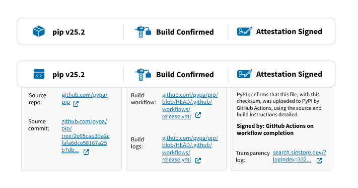 A screenshot of a UI example of the lowest level A requirements for visualising attestation information
This is intended to sit in a main section of a webpage that might use a three-column layout–the main section occupying two-thirds and a sidebar occupying one-third of the width.
In this version, each icon and heading is separated by a vertical bar/pipe that spans approximately 75% of the total height of the container box.
The panels can have a stroke or a drop shadow effect, yet should be adjusted to match whatever the platform’s design system or styles.
While this panel can be used as-is with no interactive expansion, we advise against this.
Since this component is a panel each heading should be clickable to expand additional info underneath. The expand/collapse interaction should be eased and not instantaneous for users.
The expanded sections have a border stroke and also a background color. You can omit one or the other as long as the expanded section of the panel is in close proximity to appropriate heading.
Depending on the width space you have available you can increase the width of both the panel and the expanded section. Be sure to use minimum text/font sizing available per platform for legibility.
With this Level A component styling, use words and letters conservatively in the attestation statement, balancing clarity of statement with space available. If needed, the attestation can be placed underneath at full width to accommodate complex statements (UI example on next page).
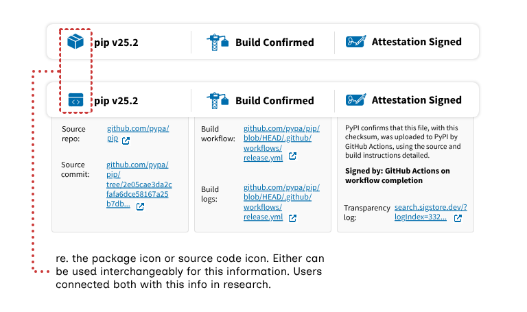 A screenshot of a UI example detailing icon information
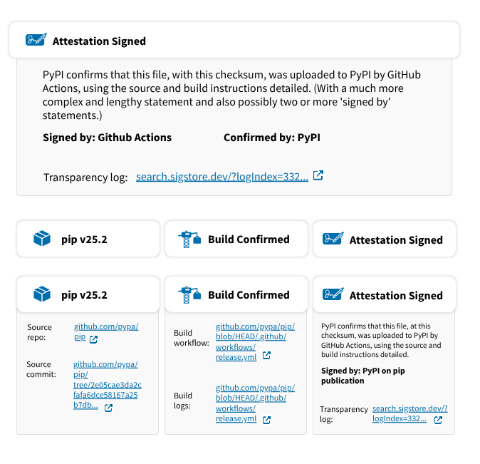 A screenshot of a UI example detailing a version of the lowest level UI that has separated ‘boxes’ and what a full width attestation ‘box’ could look like
Signed by messages: “Signed by” messages should be bold to indicate importance. They can flow over two lines but three lines should be avoided.
Links styling and icons: In this example, as in the last page, we’ve used PyPI’s visual styling with blue hyperlinks and an external link icon next to each link. Both the icon color and font can be changed to match existing styles. The use of an “open in a new tab” icon is optional.
The component variant to the left here shows when the panels are not grouped, instead they’re separate panels aligned in a row. Their expandable sections still can be activated. Some platforms may prefer separated panels like this for their pages’ global styles and/or to look more like buttons that can be interacted with.
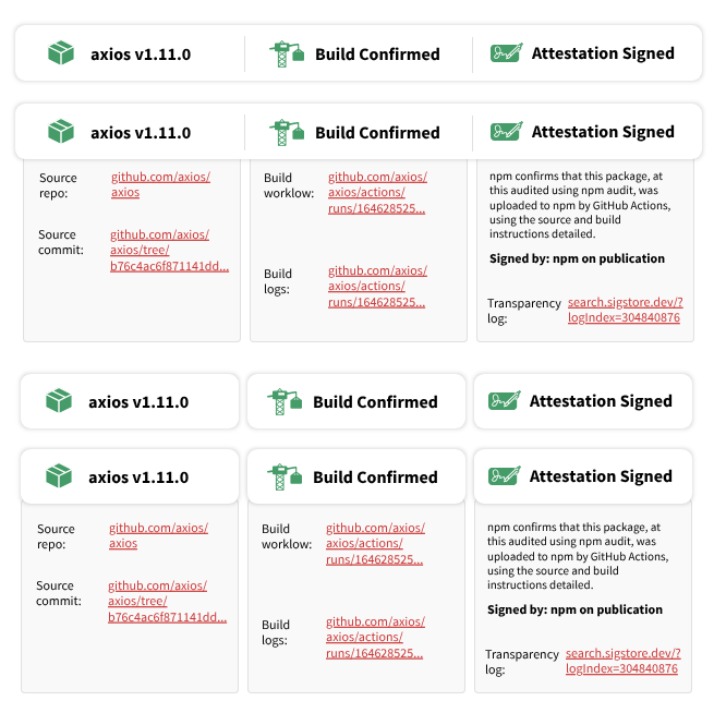 A screenshot of a UI example detailing a version of the lowest level UI with expanded tabs/details using npm style
In this example, we’ve used npm visual styles.
Link labels The links displayed here have all been carefully tested with users. In our research, we found that users expected the following information to be displayed near the attestation statement:
- Source repo & source commit
- Build commit & build logs
- Transparency log (within the attestation statement section)
We recommend left-aligning link labels, allowing them to span over two lines where required.
Enhancing user confidence Additional recommendations to help users feel confident about the security of a package are detailed in the medium (level AA) and highest (level AAA) UI recommendations.
Users also rely on “social proof” (number of downloads, maintainers, recognizable project names) typically found on registry pages. Hashes/checksums also encourage confidence, but only if users recognize them and understand their function.
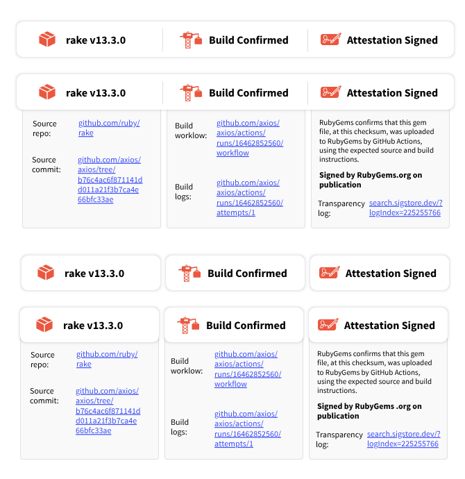 A screenshot of a UI example detailing a version of the lowest level UI with expanded tabs/details using RubyGems style
This example uses visual styles from RubyGems.
How different personas understand this UI The ‘Security architect’ persona already knows what information is needed to feel confident about a package’s security. For them, simple visual and text indicators (e.g., this UI in its collapsed state) are typically sufficient; expanding to see more information confirms their existing knowledge.
For ‘Pragmatic Developers’ and ‘Incidental User’ personas, simple visual and text indicators (e.g., this UI in its collapsed state) are not helpful and can lead the user to guess what the information means (either correctly or incorrectly).
These users need to see this UI in its expanded state to understand what attestations communicate. Viewing the detailed information typically prompts them to explore further and piece together an understanding of package security. Providing additional documentation links can also help these users learn.
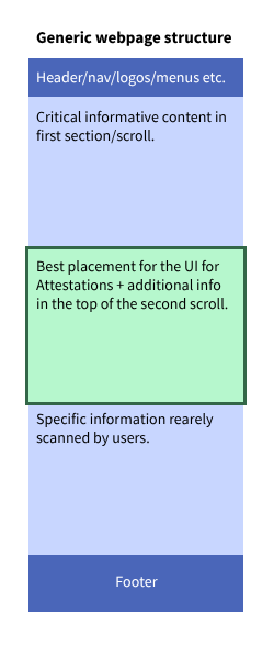 A screenshot of where the lowest level A UI should ideally be situated on a webpage
The positioning of these minimal elements on a page is also critical. The next page in this style guide illustrates their optimal positioning within each example package registry (please note that the next page is large, and you may need to scroll to find the appropriate UI example).
Ideally, this UI should not reside at the bottom of a page, particularly on platforms where extensive README files push other critical information downwards. User feedback indicates a strong preference to understand a package’s core functionality before encountering security or attestation details.
Placing these UI elements at the top of a page or within a header component presents a dilemma:
- Prioritization: It effectively “forces” (as users described) immediate consideration of security.
- Interruption: It disrupts the user’s primary goal of quickly assessing the package’s purpose.
While promoting security awareness is important, it shouldn’t overshadow essential package information. Therefore, while placing these elements in the first scroll/fold can prioritize security, it’s generally more effective to position them at the top of the second scroll/fold. This aligns better with user expectations and their natural information discovery journey.
Please open the following annotated UI full webpage examples in an image viewer of your choice. This image is large at 5.7MB and 11300x12722 pixel canvas. There is also a .pdf file.
The following text is included in the annotated image file:
- Critical information about the package has been retained at the top of the page, along with information that all users prioritize—download numbers and usage metrics. These are the primary indicators of trust in a package: that “many eyes” have seen and used the package. For most developers, this is enough to justify using a package.
- For packages that are less popular or less established, users cannot rely on this kind of “big numbers” information. In these cases, they look for authoritative information from trusted sources such as the registry website, authority bodies like software foundations, or maintainers with a reputable name.
- Some users not only rely on the aforementioned information, but also personally check security details such as matching hashes and keys, reviewing source code, and investigating the build process and origin pathways. These users typically aim to avoid risks such as introducing vulnerabilities that could expose user data (like financial or other private information), or put systems—such as company or university infrastructure—at risk.
- From our research, only certain users understood what a 256 checksum and similar information are for, or how to use them. Therefore, placing attestation UI elements related to more complex or less commonly known security terms or processes can help users better understand these difficult concepts. By positioning the UI above the checksum, users are less likely to “check out” and stop paying attention to the page when they encounter unfamiliar terms they do not recognize or have time to investigate.
- In this example from npm, you can see that the package exposes a lot of README information that the maintainers have worked hard on. During testing, users found this reasonable but somewhat over-engineered. They had difficulty finding the basic information they needed and relied heavily on the sidebar for the critical details required to decide whether to use the package.
- Based on these findings, we believe that for package pages like this, presenting attestation information in the sidebar is best. Sidebar options are discussed in more detail later in the style guide.
- If possible there should be a way for users to differentiate between maintainer provided information from the README versus index-controlled content such as the key words and provenance information.
- We recommend adding a visual break, such as a divider line or heading, here so that people understand what type of information they are looking at.
- The first place attestation information can be added is above the license information. Since the license is also detailed in the sidebar, users are generally comfortable with attestation content being positioned as high as possible on these types of pages. However, be aware that the likelihood of users discovering attestation information here is low. Most users will not scroll through these long README pages unless they are specifically searching for security, provenance, or attestation details they cannot find elsewhere on the page or in a different tab. More commonly, users will go to the project repository to find information such as build logs, commit files, source code, and so on.
- On this page (and others), you may find that detailed information is repeated in areas we suggest as supporting the attestation statement. From our user research and UI testing, we discovered that users did not find this confusing or off-putting. Instead, users were encouraged by “duplicate” information and saw no problem with encountering the same link in multiple places or seeing documentation in more than one section.
- The researchers’ hypothesis is that users seek information in a compartmentalized way. When users are specifically looking for attestation or security-related information about package builds, they tend not to notice other information not labeled as such, unless they deliberately switch their focus.
- When users did notice that the same or similar information appeared in two sections or locations, they felt more confident in the package page’s diligence at repeating critical information that might otherwise be missed. Their trust was also reinforced when two matching links appeared in different places. This response was connected to a general distrust of package information pages on registries. As one user stated, “They can put whatever they want on here, can’t they? Who even approves and checks that it’s true and accurate?” Seeing the same link repeated in two places gave some users more confidence—if a source commit is linked in area 1 and area 2 and they match, it suggests someone is ensuring consistency.
- Therefore, repeating information should not be a concern for platforms implementing this approach, but it is critical that the same headings, terms, labels, and destination links are used consistently across different locations
- The first place attestation information can be added is above the license information. Since the license is also detailed in the sidebar, users are generally comfortable with attestation content being positioned as high as possible on these pages. However, be aware that the likelihood of users discovering attestation information here is low. Most users will not scroll through these long README pages unless they are specifically looking for security, provenance, or attestation information that they cannot find elsewhere on the page or in a different tab. More commonly, users will go to the project repository to find information such as build logs, commit files, source code, and so on.
- We recommend that there be a visual divider or way for the user to distinguish when maintainer provided content (e.g. the project description) ends and index-controlled content (e.g. security information) begins. This divider line follows the existing style of the site.
- Here, you can see that the separated elements can either span the full width of the available space in the main section, or they can take up only the minimum amount of space needed by the expandable sections to display additional information.
- You’ll also notice that this information is placed underneath the project description. This positioning risks users misinterpreting the information as belonging to the previous heading (in this case, Code of Conduct). In these situations, we encourage using a divider and a heading such as “Security,” “Attestation,” “Provenance,” or another relevant heading of your choice. We also recommend, specifically for PyPI, that some information typically found in the Download Files section is difficult for unfamiliar users (and even some regular visitors) to find. If the attestation information also included any SHA/checksum details and additional information related to these topics, then placing this section at the bottom of the project description would be less surprising.
- Note: For projects with long descriptions, this information may be pushed far down the page and not be as accessible to users. If this is of particular concern, we recommend implementing a dedicated Security page such as in the Highest UI version - AAA grade.
- In contrast to the comments in the above PyPI mock-up, when expanded, this section maintains its own relevance much more strongly and may not require moving information from the download files section.