wg-securing-software-repos
Style guide: UI details
Style guide: Attestations component
Overall, all of these attestation statements tested well. We recognize that they may not be 100% technically precise in expressing the objective language of an attestation. We user tested wording associated with authority—statements that “approve,” “verify,” “validate,” and/or “confirm” that everything related to the package build was as expected.
The users we tested tended to either skim or read in detail. All of the users generally understood these types of statements and agreed they helped them believe the package was safer and more “official.” This was especially important for packages that lacked high download numbers or strong social/web-of-trust proof.
Attestations became much more critical in the smaller, niche package scenarios users described. The users we tested also unanimously agreed that the icon was helpful in understanding an attestation. The attestation statements used in these UI mock ups may not be the most literal and accurate statements. We recommend technical writers to write the most accurate attesttation claim wording.
If a registry/playtform wants to make attestations the most prominent they can, we recommend a UI with the full-width box container UI.
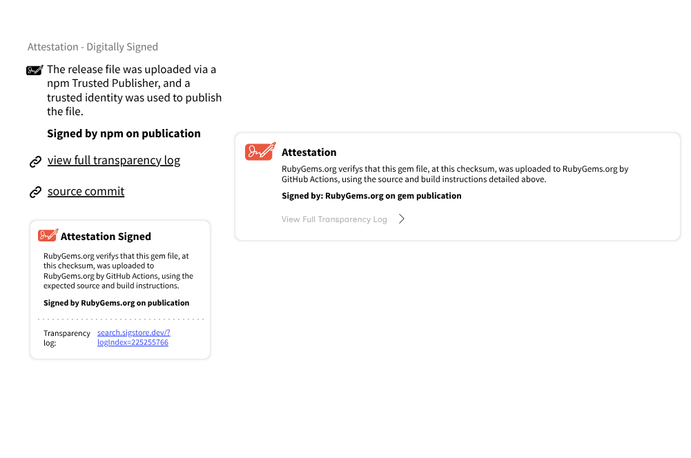 A screenshot of the UI Attestations component in isolation
Style guide: Build component
The Build component were the most important relational information to attestations that users we tested expressed as useful.
All users agreed that this information could be sourced from other locations or from the source repository itself, but having it near attestations made it quicker and easier to find and relate to the purpose of a build attestation statement.
The links shown in the mock up may not be the exact ones that the packages would use for ‘Build commit/file’ and ‘Build logs’ but as long as these destinations are what folks with technical and package knowedge would place there then users are satisfied and go where they expect to go. In testing, we had the first link with the label ‘Build commit’. We’ve since changed this label to ‘Build workflow’ to better describe the link used in the examples.
Reviewing the build commit/file and logs is a process that not everyone—except security experts we tested—knew exactly how to approach or compare; and for those users, the existence of this information helped create an impression of safety, security, and legitimacy for the package page. Typically, users we tested matched the links provided in the Build or Build confirmed components with what they could find themselves in the source repository.
All of the users expressed a desire for more documentation and guidance on how to assess build security.
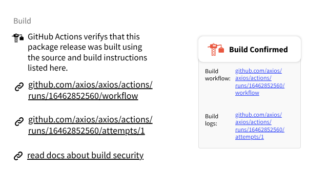 A screenshot of the UI build component in isolation
Style guide: Source component
While users could find the source information elsewhere on the package’s page, having the source repo link and source commit link in proximity to build information and the attestation again, meant users found this information easily and in the context of attestation investigation/comprehension.
To reiterate a user finding, users did not find duplicate information distracting, confusing or less-secure, they found the information useful when duplicated since they ‘could either go there from here or here’ it made their opening of relevant links and docs more convenient.
Source was one location where there are two icon options, either the box to represent ‘package’ or the browser and code brackets (<>) to represent source code.
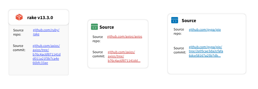 A screenshot of the UI source component in isolation
Style guide: Integrity component
The integrity section—where we display a checksum, SHA-256, or hash for the attestation—was an area that divided opinions among the internal design team.
Users we tested generally found this section to be useful and/or interesting, depending on whether they already understood what a checksum did and how to use it. Those who did felt more confident in the security of the build, attestation, or package, and were happy to see a checksum included. Suprisingly, the users we tested were not bothered by possible duplication; in fact, duplication signaled importance (as long as the values matched when appropriate and were correct).
Users who didn’t know what checksums were used for or how to use them were curious rather than confused. They sensed that the information was important and potentially useful, should they choose to invest time in learning what it was. These users only needed clear documentation or guidance links on how to use checksums, referenced near the checksum information. Again, they were not confused by potential duplication; instead, they interpreted as “this must be important”, an essential trust signal.
The term “integrity” and the magnifying glass icon helped the users understand that something was being inspected and clarified what their suggested action—investigating further—should be. Yet, internally, we also believe that “Inspect” could be used instead of “Integrity,” as “integrity” may not accurately describe this information.
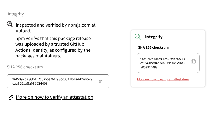 A screenshot of the UI integrity component in isolation
Style guide: Additional signals of trust
There were a few additional trust signals we tested with users that either were not included in the style guide recommendations, were minimized, or appeared only in the highest-level recommendations. This is mostly because these elements require additional work before they can be reliably implemented (e.g., Security Advisories), or they are not yet well-known terms or concepts and require their own detailed investigation and user research.
The first element that tested well with security experts—but not with less informed developer users—was sections or badges referring to SBOM (Software Bill of Materials) and SLSA3 (Supply-chain Levels for Software Artifacts) at hardened build levels.
When known, these terms provided very positive security and safety signals for a package. When not known, some users chose to search or visit documentation to learn more, but the small components tested did not offer clear incentives as to why they should learn about these concepts or what benefits they provide. Therefore, these elements need comprehensive testing with appropriate guidance for users to seek and understand related documentation.
 A screenshot of the UI for additional signals of trust
Known security advisories were included in the highest level of UI recommendations for attestations. This component tested incredibly well—so well that users often ignored other information in favor of it. (This is covered in more detail in the highest-level UI requirements.) This component requires further user research to fully understand why it is so implicitly trusted over other information.
When an attestation statement used the term “trusted publisher,” this was somewhat confusing for security expert users. Most users accepted the statement at face value and assumed the registry, platform, or another entity—such as GitHub—was taking accountability by using the label “trusted publisher.” Security experts we tested, however, wanted to know exactly who or what the trusted publisher is, and what they are attesting to.
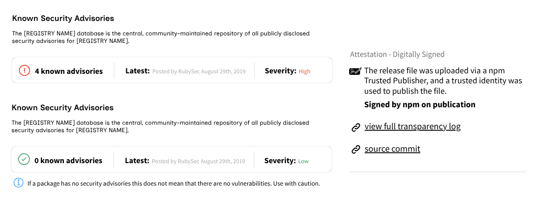 A screenshot of the UI for additional signals of trust
Step-by-step instructions for using checksums or SHA-256 were mentioned in very early user research as a way to help users with less security expertise become informed and follow the appropriate steps to process or verify SHA-256 checksums, hashes, or key signatures. The less security-proficient users indicated that if they didn’t already know what this was, they wouldn’t have time to learn the process while investigating packages. Instead, they would return to it after selecting a package or if given time in their job roles to learn or be shown how to do it.
As the style guide was further developed, we found that these processes we’d enable with this component were lengthy, difficult to fit into minimal UI, and not as critical for attestations.
A very early design for an expandable set of step by step instructions for checking hashes.
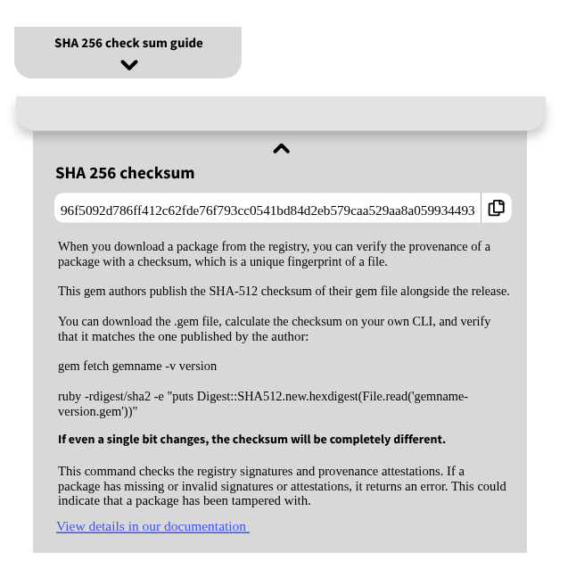 A screenshot of the UI for additional signals of trust
Style guide: Icons
Icons became a critical aspect of the attestation work. Icons helped users we tested comprehend and understand what a section or heading was intended to convey, or prompted them to take a certain action or adopt a particular mindset.
Some of our general findings on icons were:
-
Initially, no users mentioned the icons. This typically suggests that none of the icons appeared odd, strange, or out of place wherever they were used.
-
When users did mention icons, they typically praised them for matching the headings or statements they accompanied.
-
Users generally preferred filled-in icons over stroke or outline icons, though each registry or platform should use icon styles that best fit their overall visual aesthetic.
-
The only icon that should not be filled in and should always remain an outline is the blue information (i) icon (as shown in mock-ups). Users found a filled version of this icon more distracting and annoying than useful. However, retaining these info statements is critical for clarifying what an attestation can and cannot verify.
-
One participant did not like the crane icon for “Build” and preferred the unfinished wall of bricks. The wall symbolizes the process of building something, whereas the crane appeared to represent moving a package from one location to another. However, overall, the crane tested better with users.
-
The box icon symbolized a “package,” while the browser and code brackets (
<>) icon symbolized “source code.” -
The (!) warning icon should be used as sparingly as possible. Users tend to focus on this icon, which can reinforce existing feelings of distrust. Using the outlined version as well can help de-emphasize this icon.
All icons were source from an open icons SVG repo: https://www.svgrepo.com/
Links to individual icons will follow. Two unique icons were created by combining two or more open icons: the integrity magnifying glass with key, and the attestation signature icon. These will be detailed on the following pages.
![]() A screenshot of the UI for icons
A screenshot of the UI for icons
Text included in the icons image:
Re. Build icons: Use whichever you think matches your design style and if unsure - go with the crane. Brick icon was edited to remove small details Re. Security icon: The lock icon was used for highest requirements pages next to the security heading/tab Re. Warning & info icon: Advised to only use the outline/stroke versions of the ! and i icons. Re. SLSA3 icon: Early designs used this recipet icon for SLSA3. Re. SBOM icon: Early designs used this recipet icon for SBOM. Re. Copy icon: Used where a copy function against a CLI command or hash was Re. Links icon: Only used to mimic existing link icon styles in registry pages
![]() A screenshot of the UI for signature icon
A screenshot of the UI for signature icon
The signature icon was a critical icon to construct and took detailed editing of existing icons to balance the width and height of a signature, pen and container and/or the ‘box or ‘line’ that people sign on a paper document. User all agreed this icon helped them to get an idea of what an attestation and references to ‘signatures’ mean’t within the context. That some entity is ‘signing off’ in some way to the statement being made in the attestation statment.
![]() A screenshot of the UI for icons
A screenshot of the UI for icons
Text included in the icons image:
Re. Source icon: Source icon was used as is from the open source icon repo. Users described needing this icon after seeing the package used for ‘source’ Re. Integrity icon: The integrity magnifying glass was created by combining two icons. Users described the key in the magnifying glass as being critical to communicate ‘investigating the security’. The term ‘Integrity’ also helped users understand that the information with this icon and heading was there to help them ‘seek information related to security’ Re. Package icon: The package icon was an edited version of some complex boxes from the icon repo. This box accurately communicated package to all users where it was used. They expected to see package info like source repo and package ino like version, name etc.
![]() A screenshot of the UI development for an attestation specific icon
A screenshot of the UI development for an attestation specific icon
Early on some design work was done to try to reduce the attestation UI down to a single icon or badge. After some effort it was decided that for most users that are not security experts a badge or icon without any messaging wouldn’t be useful. The only user person that a badge/icon is useful for are people who are alreayd well informed about attestations and begin to associate that knowledge with whatever badge/icon was cerated. There was no simple way to reduce these concepts into a symbol. It is worth re-exploring with a graphic desing, icon or other expert in brand/indentity language what can be created but for now, the progress made on attestation badge/icons is below.
Some of our early designs attempted to ‘tell the story’ of attestations from ‘origin’ to signed attestation statement on a package. We developed visual styles that used a mail/postal package being delivered and signed. This story /inforgraphic visual has potential but within registry pages for UI it was too complicated and required a user to swap to info gathering to story comprehension mode. Infographics could be good for documentation pages and should be tested.
- https://www.svgrepo.com/svg/446714/magnifying-glass-2
- https://www.svgrepo.com/svg/437226/signature
- https://www.svgrepo.com/svg/212549/signature
- https://www.svgrepo.com/svg/509138/info
- https://www.svgrepo.com/svg/532318/key
- https://www.svgrepo.com/svg/521262/warning-circle
- https://www.svgrepo.com/svg/449387/lock
- https://www.svgrepo.com/svg/355633/bill-1-solid
- https://www.svgrepo.com/svg/325456/open-in-window
- https://www.svgrepo.com/svg/471214/code-browser
- https://www.svgrepo.com/svg/471736/package-check
- https://www.svgrepo.com/svg/525265/check-circle
- https://www.svgrepo.com/svg/510388/copy
- https://www.svgrepo.com/svg/523501/link
- https://www.svgrepo.com/svg/426115/crane
- https://www.svgrepo.com/svg/414268/build
Icons are licensed under different OSS licenses. Some require attribution, see https://www.svgrepo.com/page/licensing/#CC%20Attribution.
Style guide: Hyperlinks
User behavior and attitudes towards hyperlinks were nuanced, especially when balancing user preferences with the limited space available in components.
We found two details are critical with hyperlink usage:
-
If space constraints prevent displaying the full URL, ensure the complete URL is shown on hover (by mouse or tab).
-
Each link’s descriptive text should clearly indicate the link’s destination or purpose, avoiding vague labels (e.g., use the text
See steps to complete process a checksum hash >instead ofLearn more >)
Examples:
Any of the following variations of hyperlinks can be used; yet, their styling should always be accessible and consistent with the global styles for other hyperlinks across the platform.
-
Label with a full URL where space allows:
Transparency log: https://search.sigstore.dev/?logIndex=304840876 -
Label with a ellipsis truncated URL, provides full disclosure on hover:
Transparency log: https://search.sigstore.dev/?lo... -
Label with a shortened URL:
Transparency log: search.sigstore.dev/?logIndex=304840876 -
Descriptive phrase with hyperlink styling:
View transparency log >
Styling for hyperlinks should also follow the same style as other links across the platform.
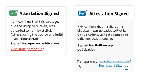 A screenshot of the UI development for hyperlinks
Style guide: A note on right to left languages
All designs were created for package registries using left-to-right, English-language characters. We did not have scope to explore languages with longer words, such as German, or languages that are read right-to-left, such as Arabic.
Should work continue on this project or similar content, translations into languages other than English should be done and tested. Additionally, designs should be evaluated for tab navigation, screen-reader compatibility, and accessibility tools such as eye-gaze trackers, which may require larger hit areas for selection.
We also recommend testing iconography to ensure that no icons convey unintended meanings in cultures beyond the assumed Western, US/European, English-speaking context.
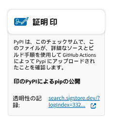 A screenshot of right to left languages
Japanese is an example of ‘signature’ or サイン being a more modern word but many Japanese people still use a ‘stamp’ (印鑑) as their signature.
 A screenshot of right to left languages
Arabic needs to have all elements viewed right to left.
 A screenshot of right to left languages
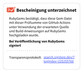
German is also a useful example as it often has words that in English are two words ‘Transparency log’ and in German are one word ‘Transparenzprotokoll’
Style guide: Documentation recommendations
Supporting users with effective documentation is key to helping them build an understanding of what attestations are and how they can be used.
Our research found that existing documentation about attestations was either missing entirely or written only for expert audiences. To address this and to support our UI recommendations, we suggest the following principles to help registries create effective documentation for attestation consumers.
Attestations documentation principles
- Use key terms consistently
- Structure documentation around user roles
- Provide content to help package consumers understand attestations within the context of other security features
- Warn package consumers that packages are not secure by default
- Normalize secure-by-default publishing workflows
- Explain common attacks and how they are mitigated
- Be transparent about limitations and set clear expectations
For more information on each principle see Best practices for documenting attestations in Package Repositories.
Style guide: Applying documentation principles to RubyGems.org, PyPI and npm
To help RubyGems.org, PyPI, and npm adopt attestation documentation best practices, we have created specific recommendations for each repository. Each recommendation includes user-tested templates that can be used to create new documentation or revise existing materials.
We encourage RubyGems.org, PyPI and npm to use, improve, and extend these templates as they see fit. Other package repositories can also use these templates as inspiration for their own attestations documentation.