wg-securing-software-repos
Style guide: Level AAA - Highest requirements
The highest level of UI recommendations includes adding attestation information and/or links in an available sidebar section of a registry site or platform as well as a new security page, tab or section (depending on the platform architecture). The sidebar content can link to this security content when interacted with by users seeking more detailed information.
Security page section
Having a separate, dedicated security section or page was the UI design that tested best across all user personas. Security Experts, Pragmatic Developers, and Incidental Users all found that a dedicated security page was the best place to locate the information they expected when looking for “information that helps them make a secure and safe choice about the packages they use.” This included attestation information.
Users admitted that, during their typical workflows, the security section is not their first stop when gathering information; instead, they usually begin with the general package description, source repository links, and social proof metrics. However, the security section became easily recognizable once they were ready to review security and safety-related information. This meant users were not left guessing whether they were in the right place for security details about a package or build. When such information was placed on the main registry or platform pages, users had to do extra cognitive work to determine what attestations and related data meant in that context. They spent critical seconds scanning attestation statements and asking themselves, “Where am I, and what is this information in relation to exactly?” Within a dedicated security page or section, that effort was eliminated.
Several users also noted that having a security page gave them the impression that the registry/platform and package were “serious and committed” to security. It also allowed for additional information to be included, in case more security details or advice needed to be added in the future.
Some registries and platforms will not have pages or tabs where a dedicated security page can be added. In these cases, as with the example of the RubyGems package below, adding a security section beneath other sections is sufficient to set it apart and provide a link from sidebar content. Further details are provided in subsequent sections about how security page sections were tested and user rationale.
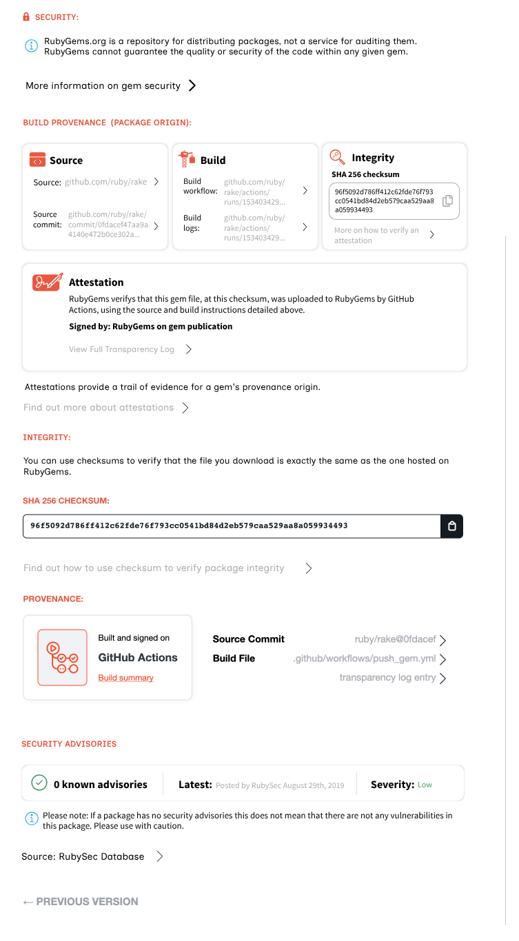 A screenshot of a UI example of the highest level AAA requirements for visualising attestation information along with entire security page content example
With registries or platforms like PyPI that have a left-hand menu, the security page can be added there.
PyPI is a complex example, as there is a lot of different information that users in testing considered to be “security” information that could be included in this section. The best advice is that platforms should make informed decisions about what existing information moves to the security page and what information should be linked from the security page.
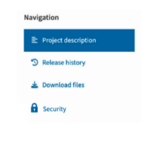 A screenshot of a UI example of the highest level AAA requirements for visualising attestation information along with entire security page content example
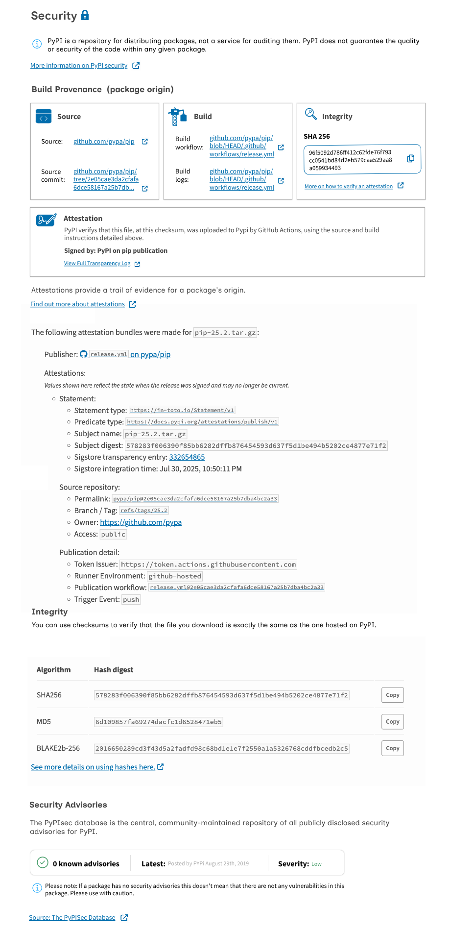 A screenshot of a UI example of the highest level AAA requirements for visualising attestation information along with entire security page content example
With registries or platforms like npm that have a navigation tab bar, the security page can be added there.
In the npm examples we tested, the packages often displayed entire READMEs, which meant many pages of scrolling to find any information not included in the README. In some cases, users were confused about which information was written by package maintainers and which was provided by the registry. One suggestion that was offered, but not explored in the UI, was to add author names to content, including the publish date. For example: “This security page was last updated on [ DATE ] by npm to include [ DETAILS ].”
 A screenshot of a UI example of the highest level AAA requirements for visualising attestation information along with entire security page content example
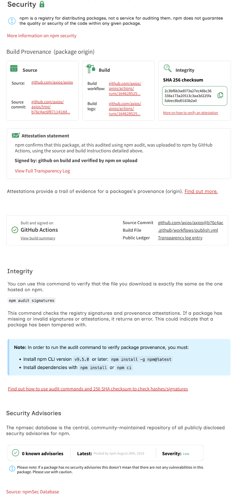 A screenshot of a UI example of the highest level AAA requirements for visualising attestation information along with entire security page content example
Sidebar - Minimal If present on a page, the sidebar typically already contains critically useful information to help users decide whether or not to use a package and/or if a package is safe. This is usually where downloads, releases, source code or repository links, and contributors are listed. These pieces of information are important not just for safety and security, but are generally useful for users when exploring packages.
The sidebar also became the primary location where users wanted to see attestation information. However, users indicated that they did not want attestation or security content to push down the other important information. They were also unlikely to read detailed or lengthy text content in sidebars.
A minimal sidebar should therefore only be used in conjunction with a dedicated security page or section, with sidebar links functioning like “bookmarks” for the related security information on the page, directing or focusing the user on the relevant section when clicked (e.g., when the sidebar “Build confirmed” is clicked, it should focus on the “Build confirmed” section in the security page). In rare cases, components styled to meet Level AA requirements can be used optionally here in the UI alongside the minimal sidebar.
Sidebar - Maximum The maximum sidebar is a UI designed for users who are unlikely to explore the security page and do not want to dive deeply into security information or be redirected there by a link in the sidebar. These users are relatively rare, as the general expectation for sidebars is to contain only a few words of text (certainly not full sentences). However, there are scenarios where registries or platforms may want to display as much information in the sidebar as possible, or include some of the content from the security page as well.
See below dedicated security sections, nav bar tabs and left hand menu tabs. We tested the term ‘security’ with and without the lock icon and it was preferred with the lock icon as so to reinforce user understanding of what this section does. It was not confused with a ‘locked’ section.
There may be cases where the visual style of a registry or platform does not allow for icon usage. It is acceptable to omit the lock icon in these cases.
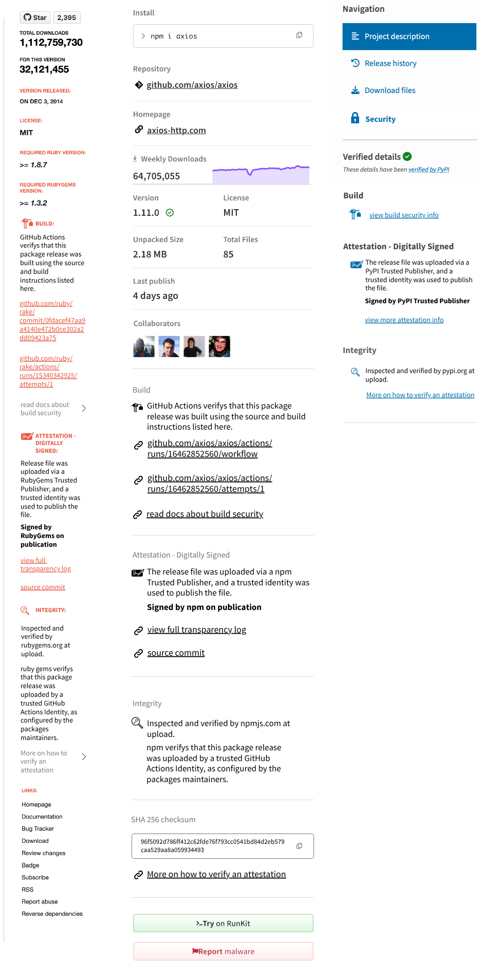 A screenshot of a UI example of the highest level AAA requirements for visualising the sidebar content specifically
As previously stated, when positioning attestation content in the sidebar, it should not appear above essential general information such as:
- Source code repository links
- Homepages/URLs (if applicable)
- Releases
- License
- Download numbers (weekly, etc.)
- Version number
- File size
- Last published date
- Maintainer/Contributor profile pictures and/or names
Typically, this means that attestation information will still appear within the first scroll of the sidebar. Ideally, it should be placed as high as possible without displacing essential information.
We tested some expandable sections in the sidebar, but these did not perform well with users. There is a general expectation that sidebar information should be presented as is, or take you to an internal or external link, rather than expanding or contracting within the sidebar.
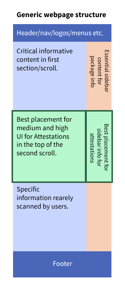 A screenshot of the highest level AAA UI showing good and bad placement
Please open the following annotated UI full webpage examples in an image viewer of your choice. This image is large at 3.2MB and 10982x5000 pixel canvas. There is also a .pdf file.
The following text is included in the annotated image file:
- These sidebar designs are the information-dense versions, where all relevant and helpful details to support attestation comprehension are surfaced. These sidebars can function on their own as a “light/medium” implementation or in combination with Level AA requirement card components, or as part of the Level AAA security page implementations described on this page.
- These sidebar designs were heavily informed by the fact that users we tested with found the most useful information in the sidebars already. The users prioritised “social web of transparency” information alongside the source code and repository links which are typically included in the sidebar of existing registry pages. However, like in main page content users did not want attestation information and supplementary info below these critical general pieces of information. This typically means the attestation information still appears above the fold, within the first scroll, for most pages.
- You can see that the information can look squeezed into a small width for sidebars like RubyGems page layout. We recommend that the sidebar widths not be any narrower than this example, as writing sentence-length content in a smaller space would be difficult for developers to read and comprehend.
- These sidebar designs are the minimal information versions, reduced to the essentials: icon, heading, and links.
- Links in the minimal sidebar design must direct users to a dedicated security page for each package. This approach works especially well for pages that feature extensive README content or large amounts of package information. This allows the sidebar content to appear higher on the page, but not necessarily before the README, while components with additional detailed information can be placed after the README.
- The only information that is not minimized is the attestation statement (or a selected attestation statement if there are multiple on a package). This statement must always be shown in full, accompanied by its icon and a link to more detailed information in the security section.
- Security page for npm would be via a new tab ‘security’
- Security page for PyPI would be via a new left tab ‘security’
- Security page for RubyGems would be via a new main section header for RubyGems in the main page
- Underneath the security heading you can see a short yet visually not overwhelming. This directs users immediately to more detailed documentation on gem security should the user immediately want to dive into the documentation.
- Because RubyGems doesn’t have separate pages for some packages, including a new heading, below the last heading that reads ‘Security’ allows us to place the relevant security related information, along with the attestation information here.
- The layout here may looks familiar to the lowest and medium UI designs. This section does follow the same ‘container box’ UI in horizontal row numbers that make sense given the page width.
- Here it’s essential that the attestation/s take up the full width of the page or occupies more width that the build, source and integrity in order to give visual priority to the attestation section. The reason we don’t lead with the attestation section over the build, source or integrity is because those sections are more commonly known/understood whereas attestations are understood better in relation to those pieces of information, so leading with build, source and integrity, then attestations sets up the user for thinking about build security and who/how is verifying that.
- The heading of build provenance was added when we found that users needed more context around what the attestation and supplementary info is trying to inform users of. This heading makes the meaning explicit.
- Similarly, there’s a message under the attestation container box that further attempts to clarify what attestation information is meaning to inform users of.
- The integrity section contains any other existing information related to provenance or package security processes. This is where some information may now have duplicates in the page.
- As noted elsewhere in this style guide duplicates are not a problem for users and give them more confidence in the package information as long as the duplicate information indeed matches when it is supposed to.
- The last section here is a security advisory section. This should be present if the platform has a way to pull in and display any reliably sourced advisories. If a platform has no access to a database of security advisories then this section should be omitted.
- The section is placed at the bottom due to in user testing users were very positively inclined to this section. They were so positively responsive to this section they often stopped looking at any other information in order to check for security information about the package. Deprioritizing this section and placing it low is to stop users from focussing solely on that section.
- Note that on each of these next designs the minimal information sidebars are also present.
- These sections on the side bar, when clicked should ‘focus’ and/or send the user to the appropriate section in the main page in the security section.
- PyPI has a security tab in the menu
- Different platforms and registries have different detailed security information that can be brought into the security tab/pages
- npm has a security tab in the menu nav
Next: UI Details